CASE
LÆGEFORENINGEN
A user-friendly website with improved interface for editors
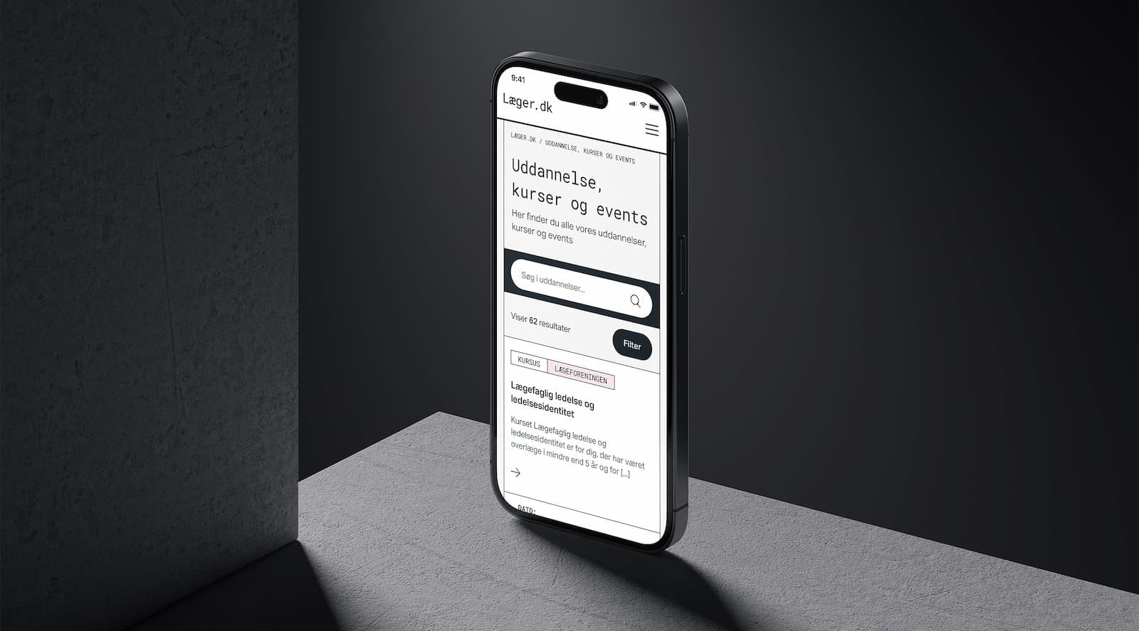
Doctors in Denmark are now met with an innovative and intuitive design, improved navigation, and a more personalized experience when they visit Lægeforeningen. The Danish Medical Association's new website is a meeting place for the visitors of Lægeforeningen and its three affiliated negotiating unions: Yngre Læger, Praktiserende Lægers Organisation, and Foreningen af Speciallæger.

One Website, Four Associations
As a doctor in Denmark, you are most likely a member of the Danish Medical Association, who looks after the political interests of doctors and works to promote education, research and development. To best support members throughout their medical life, the Danish Medical Association wanted to create a more member-focused online universe on Læger.dk. In addition, the website was to be presented as a gathering point and common place for the Danish Medical Association and its three affiliated negotiating unions: Yngre Læger, Praktiserende Lægers Organisation, and Foreningen af Speciallæger.
With a technical platform moving towards obsolescence, the Danish Medical Association came to us with two challenges. First and foremost, they were forced to decide whether to upgrade or replace their CMS - a task that would require a major overhaul and thus prompted a strategic decision to give their website a boost. With a new information architecture, updated UX and a completely new design, Læger.dk was to offer an improved online user experience and embrace the four independent associations’ brands, each with their own visual identity.
An important task was to present the four associations as the community they are. The desire was therefore a neutral expression on Læger.dk, which should contain all the general content that is relevant for doctors to know - based on topics that, through data analysis, proved to be the most important across the members.
A New Online Universe with the Members in Mind
The Danish Medical Association's purpose - to be the doctors' voice and safety net - makes it their most important task to make it easy for members to find what they need. In collaboration with the Danish Medical Association's employees, and with insight into the members' online behavior on Læger.dk, the site's structure and navigation were rethought based on what turned out to be the members' greatest needs and most visited pages. The combination of a new information architecture and a new design gives members the opportunity for quick segmentation and situational navigation, ensuring that they get the right content and are met right where they are in their medical life.
To optimize the work of the Danish Medical Association and meet the different needs of each of the four associations, the association's editors were introduced to a new CMS system to manage and distribute their electronic content. Today, Læger.dk, is built on Umbraco 12, which offers a best-in-class editor experience and an extremely user-friendly user interface.
With Umbraco, our editors’ workflows have improved substantially. We now have better ways of structuring our content professionally and it’s way easier for us to collaborate. The interface is simple and intuitive, and we have just the options we need.
Mette Tandrup
Yngre Læger


A Neutral Web Design with a Common DNA
The four brand colors of the associations (red, orange, blue and turquoise) were the starting point for a solution that could present the associations as a common property and as one entity across Læger.dk. By mixing these, a unique black color was brought to life which now serves as the basic element of the common, neutral brand identity on the website. Where Læger.dk previously contributed to significantly greater traction for Lægeforeningen, each association is now allowed equally to stand out with their own identifiable color in a neutral black and white design. For a more gentle, harmonious expression, the colors were further softened to four matching pastels that reflect the associations' balance and collaboration, and further contribute to the site's accessibility.
An Improved User Experience for Both Editors and Members
The UX updates, the new design features and the even sharper communication have made the new Læger.dk a popular solution for both members, as well as internally at the Danish Medical Association, which today experiences streamlined work processes and optimized resource use. By making the members' needs the focal point, we have succeeded in fulfilling the Danish Medical Association's wish for a more user-oriented online universe on Læger.dk, where the digital user experience and the visual expression go hand in hand.
The new Læger.dk design does the unique job of uniting our four associations and their respective brands in a modern and elegant way. Each association has its own universe, but the website also serves as a common space to better support doctors in Denmark no matter where they are in their career regardless of their need for information and guidance.
Katrine Henningsen
Lægeforeningen

How the solution contributes to Agenda 2030
Contribution to SDG 8, Decent Work and Economic Growth: Through intuitive design and personalized content, Lægerforeningen’s new website enables the members to easily find information about their specific union’s terms, support services and networks which can be helpful for the members throughout their careers.
Do you want to know how we can assist you?
Give us a call or send a message, and I will get in touch with you.

Urban Nyblom
Business Director
Knowit Experience Stockholm